There are still summer days when the heat feels endless and only one thing sounds right: a cold treat from Dairy Queen. For many families, a trip to DQ isn’t just about ice cream — it’s a ritual, a memory, and a symbol of carefree moments. Long before the first bite of a Blizzard, many people recognize that familiar red, tilted ellipse from far down the road.
But that famous logo isn’t just a random design. Over the decades, it has quietly told the story of how a small ice-cream shop grew into a global brand.
Where It All Began
When Dairy Queen opened its first store in 1940 in Joliet, Illinois, the logo was simple. It was a straightforward wordmark that read “Dairy Queen” in a classic font. No swooshes, no symbols — just a clear name promising soft-serve treats.
As the brand expanded, designers realized the logo needed a distinct identity. By the 1950s, the name was placed inside a tilted ellipse. That tilt wasn’t accidental. It gave the impression of motion, suggesting speed, energy, and friendly service.
The Familiar Red Oval
By 1960, the logo evolved into the version many people still remember from childhood: a bold red oval with “Dairy Queen” inside. Some observers even interpreted the oval shape as a pair of lips, creating a subtle, welcoming smile. Whether intentional or not, it added warmth and friendliness to the brand’s image.
This era cemented Dairy Queen as more than a shop — it became a happy destination tied to summer and family outings.
The Switch to “DQ”
In the late 1990s and early 2000s, the company modernized its look. The full name was shortened to the initials “DQ,” making the logo cleaner and easier to recognize worldwide.
In 2001, two curved lines were added:
- Blue swoosh: representing cold treats like ice cream, sundaes, and Blizzards
- Orange swoosh: representing hot foods such as burgers and fries
This change signaled that Dairy Queen had grown beyond desserts into a full quick-service restaurant.
The Meaning Behind the Colors
The colors also carry emotional weight:
- Red: energy, excitement, and passion
- Blue: calmness, freshness, and cool relief
- Orange: warmth, fun, and appetite appeal
Together, they reflect both the hot and cold sides of the menu — and the cheerful experience DQ aims to deliver.
More Than Just a Logo
Today’s DQ logo still features the red ellipse and the blue and orange swooshes. It balances heritage with modern branding. For many, seeing it brings back memories of road trips, family nights, and that first spoonful of soft-serve on a hot day.
It’s a reminder that strong brands aren’t built only on products, but on emotions and experiences.
Next time you grab a Blizzard or a coffee with that red emblem on the cup, take a second look. That simple symbol carries over 80 years of history, design choices, and joyful memories.
Related Posts

The Deadly Ingredient Hiding in Your Kitchen: Why That Bitter Taste Could Be a Fatal Warning
You may think you’re serving a healthy, home-cooked meal, but an unusually bitter taste could signal something more serious than bad seasoning. Food safety experts warn that…
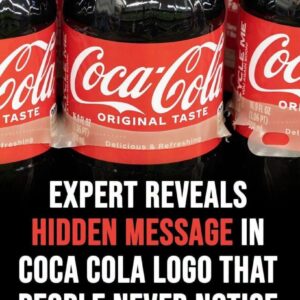
Viewers Spot a Subtle Detail in Coca-Cola’s Iconic Logo
Some people have noticed that the second “C” in the Coca-Cola logo looks like a smile—and once you see it, it’s hard to ignore. The familiar red-and-white…

A Viral ICU Rescue Clip Wasn’t What It Seemed
A tense hospital video recently spread across social media, showing what appeared to be a nurse rushing to save an unconscious patient in an intensive care setting….

‘Most beautiful girl in the world’ Thylane Blondeau marries French DJ in fairytale Paris wedding
Thylane Blondeau was six when the world decided how she should look. Now 25, she has stepped into a new chapter—one defined on her own terms. Once…

I found this tiny white stick in my son’s room and was too embarrassed to ask him does anyone know what it is?
What I thought was a mysterious gadget turned out to be something surprisingly ordinary. After searching online and comparing photos, I discovered it wasn’t a vape, hidden…

Charlotte Airport Faces Flight Delays Followin
Operations at Charlotte Douglas International Airport experienced temporary delays after a Frontier Airlines aircraft was involved in an unusual ground servicing incident before departure. Although the event…