At first glance, the Starbucks logo feels polished and iconic—something you’ve seen so often it almost fades into the background. But its power doesn’t come from perfection. The siren at its center was inspired by maritime mythology and literary roots like Moby-Dick, reflecting the brand’s early connection to seafaring coffee trade. Over time, as the company evolved, so did the logo—shifting from a detailed brown emblem to the simplified green symbol recognized worldwide today.
Look a little closer, though, and something subtle stands out. The siren’s face isn’t perfectly symmetrical. Her features—eyes, nose, and shading—carry tiny, intentional variations. These aren’t mistakes; they’re design choices. Perfect symmetry can feel artificial, almost lifeless. By introducing slight imbalances, designers created a face that feels more organic, more approachable—something your brain registers as familiar, even if you don’t consciously notice why.
This idea taps into a deeper principle of visual psychology. Humans are naturally drawn to faces and patterns that feel “real,” and real things are rarely flawless. That gentle asymmetry gives the logo a sense of warmth and presence, turning it from a corporate symbol into something that quietly resonates. It’s not just a brand mark—it’s a character, one that seems to meet your gaze rather than simply exist on a cup.
So the next time you hold that green cup, take a second look. What makes the logo memorable isn’t its precision, but its imperfection. In a world full of polished branding, it’s the small, almost invisible details that create connection—and keep something as simple as a logo feeling alive.

Related Posts

The Deadly Ingredient Hiding in Your Kitchen: Why That Bitter Taste Could Be a Fatal Warning
You may think you’re serving a healthy, home-cooked meal, but an unusually bitter taste could signal something more serious than bad seasoning. Food safety experts warn that…
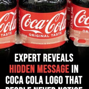
Viewers Spot a Subtle Detail in Coca-Cola’s Iconic Logo
Some people have noticed that the second “C” in the Coca-Cola logo looks like a smile—and once you see it, it’s hard to ignore. The familiar red-and-white…

A Viral ICU Rescue Clip Wasn’t What It Seemed
A tense hospital video recently spread across social media, showing what appeared to be a nurse rushing to save an unconscious patient in an intensive care setting….

‘Most beautiful girl in the world’ Thylane Blondeau marries French DJ in fairytale Paris wedding
Thylane Blondeau was six when the world decided how she should look. Now 25, she has stepped into a new chapter—one defined on her own terms. Once…

I found this tiny white stick in my son’s room and was too embarrassed to ask him does anyone know what it is?
What I thought was a mysterious gadget turned out to be something surprisingly ordinary. After searching online and comparing photos, I discovered it wasn’t a vape, hidden…

Charlotte Airport Faces Flight Delays Followin
Operations at Charlotte Douglas International Airport experienced temporary delays after a Frontier Airlines aircraft was involved in an unusual ground servicing incident before departure. Although the event…